Right tool for the right job.
-
Time Series Decomposition.
-
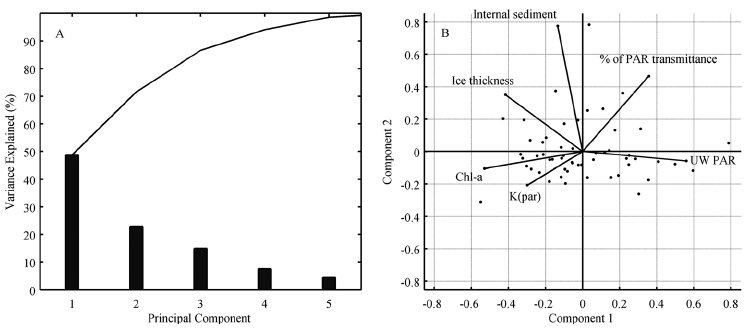
Principal Component Analysis.
-
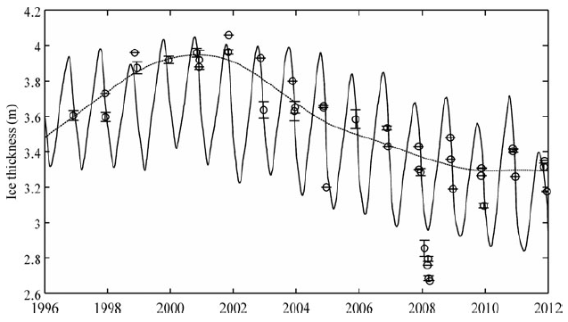
Trend Detection.
-
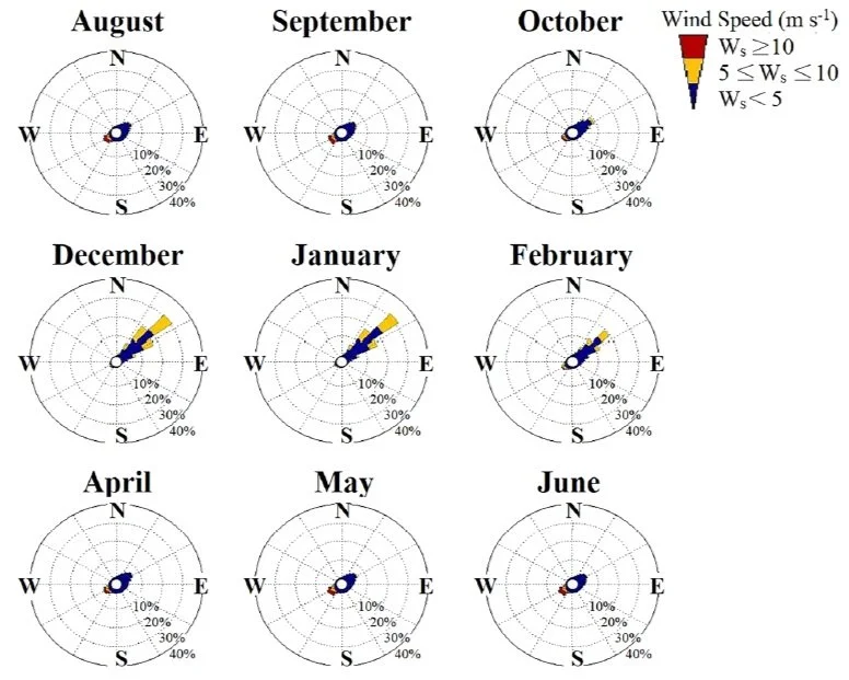
Rose Diagrams.
-
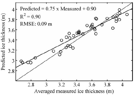
Root Mean Square Error. Correlation Coefficient. Correlation of determination.
-
Data Interpolation.
-
Curve Fitting.
-
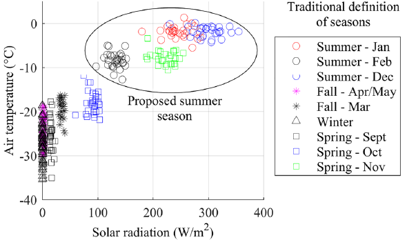
Cluster Analysis.
-
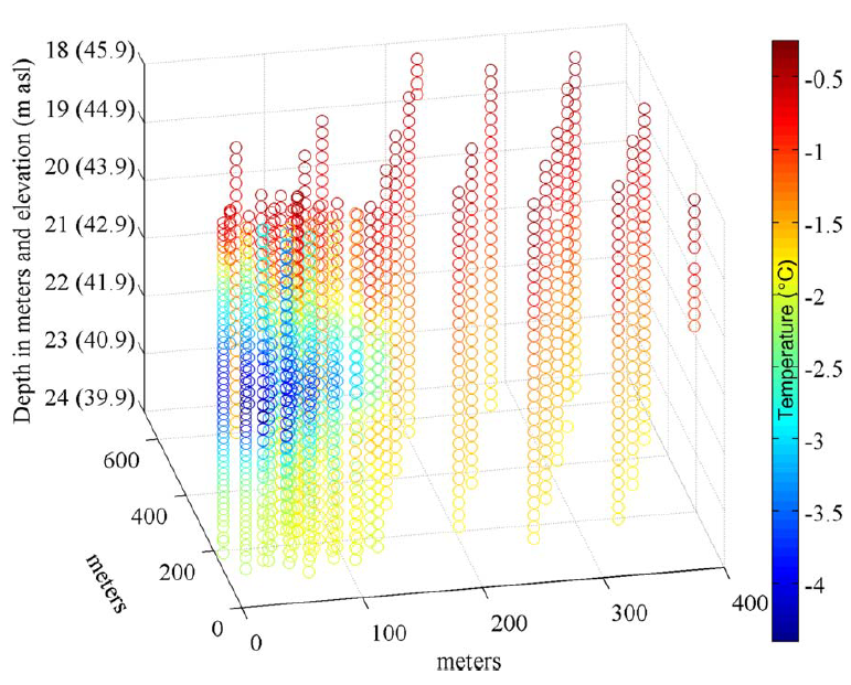
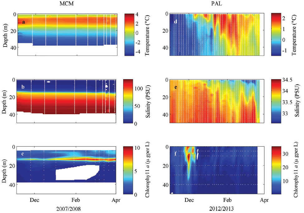
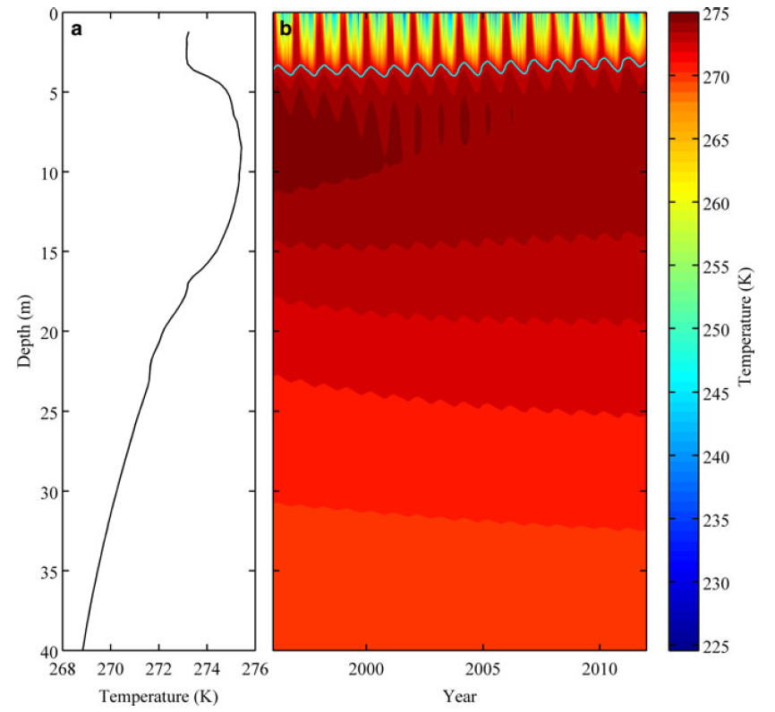
3D data plotting.
-
3D Visualization.